The LOGO
At first glance, this image is simply two birds in conversation — a fitting metaphor for coaching. But every element was chosen with intention.
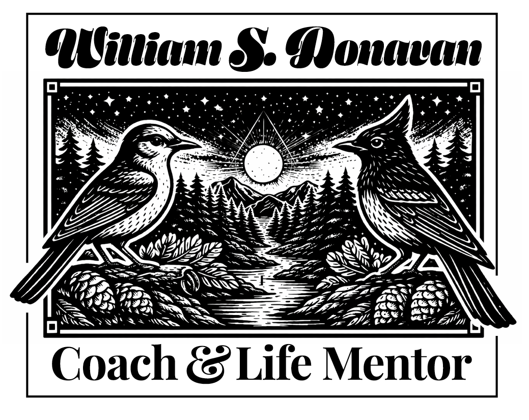
The Birds
The bird on the left is a Piñon Jay, native to the pinyon-juniper woodlands of South Central Colorado. Though it blends into the high desert landscape, the Piñon Jay is rarer than most people realize — intelligent, perceptive, and worth a second look. This mirrors how I see my clients: people who may not immediately stand out in a crowd, but who carry something genuinely uncommon once you pay attention.
The bird on the right is a Steller's Jay — a bolder, more solitary presence. Unlike the Piñon Jay, it doesn't travel in flocks, and when it appears, it tends to stop you in your tracks. Both birds share a striking blue coloring and a similar size, yet they are unmistakably different creatures. That contrast — shared qualities, distinct natures — is exactly the kind of dynamic that makes a coaching relationship rich.
These two birds don't represent fixed roles. Some days I'm the rare one being discovered; other days my client is. The Steller's Jay that startles you into awareness can be either of us, depending on what the moment calls for.
The Triangle
Centered between the two birds is a triangle, representing the core structure of Co-Active coaching's power triangle — the coach, the client, and the coaching relationship itself. In this model, the coach grants power to the relationship, and the client grants power to the relationship as well — not to each other. The client is then empowered by that relationship to take charge of their life and the choices they make. The triangle isn't a hierarchy — it's a balanced structure where the conversation between two people creates something neither could generate alone.
The Four Corner Boxes
The four squares framing the image represent the four cornerstones of the Co-Active model, which form the philosophical foundation of how I work:
People are naturally creative, resourceful, and whole — Nothing is broken or needs fixing; every person already has the ability to resolve the challenges they face.
Dance in this moment — the relationship is fluid give-and-take, and everything that arises is an opportunity for learning and movement.
Focus on the whole person — people are a complex, unique system where each part affects the others, encompassing mind, body, spirit, and emotion.
Evoke transformation — life's nature is to transform and evolve, and it is essential to call that transformation forth in one another.
Together, the birds, the triangle, and the four corners tell a single story: two distinct people, meeting in a space built for real change.
The Typography
Designers are taught never to pair two display typefaces. Pick one to lead, keep the other restrained. Breaking that rule usually produces chaos. This logo breaks it on purpose. The script above is ornate, almost medieval in its flourish, carrying personality, history, a sense that something layered and complex is present. The bold serif below is its opposite: steady, grounded, plainspoken. One reaches toward expression; the other toward clarity. That tension is the whole point. Coaching isn't a tidy, single-note relationship. It asks two very different presences to share the same space without one flattening the other. The typography doesn't resolve the contrast. It holds it. Just like the work itself. Some rules are worth breaking when the rule-breaking carries meaning.